Thingsy brought a ecompletely new service to market. Manage your household items or "things" and extend their life. The idea was strong, the detailed concept was still missing.
The biggest UX design challenge: connecting four very different functionalities into one seamless experience.
I started with user flows that considered all the information and served as the foundation for the wireframes.
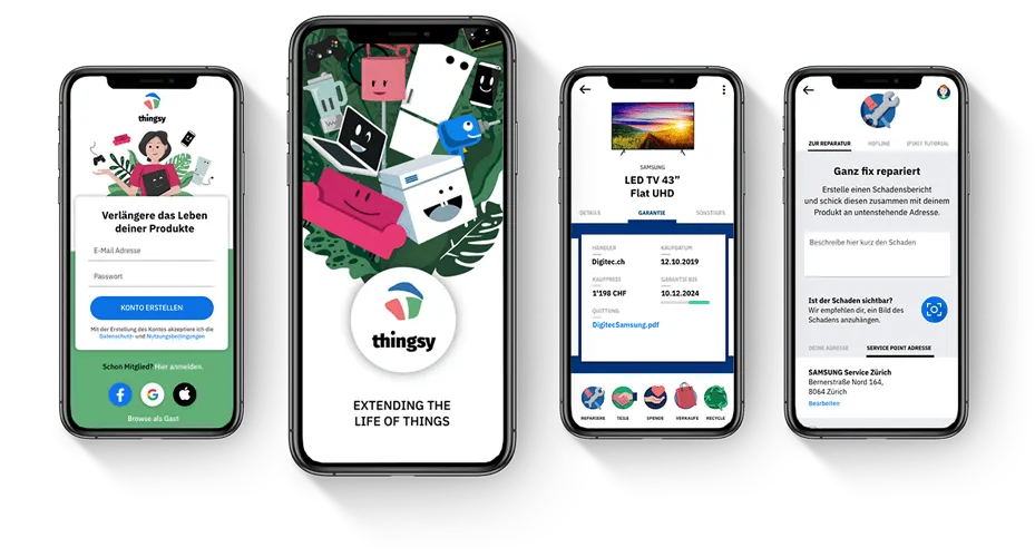
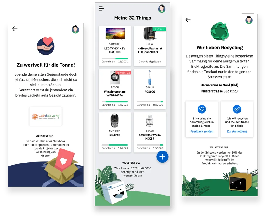
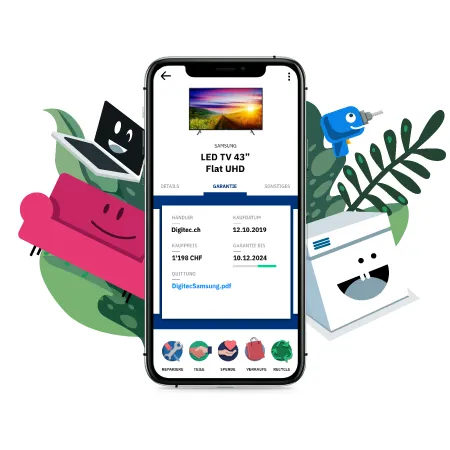
The illustrations were the heart of the app from the very beginning. I developed a style that brings household items to life in a warm and playful way. The client loved them immediately and adapted the style for another project straight away.
Because the illustrations were so strong, I deliberately kept the rest of the interface minimal: black and white elements, a touch of blue as the action colour. Nothing unnecessary to distract from the illustrations. A clean, clear UI design that guides users intuitively through the app.
What started as an app concept grew steadily over 14 months. The client's trust in my work led to further projects being added: new app features, concept development for insurance cooperations, the product website and pitch presentations for investors.