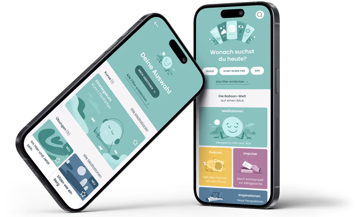
Balloon is one of the leading meditation and mindfulness apps in the German-speaking market.
The MissionMe team asked me to provide UX/UI Design support to restructure the "Discover" section and make content such as courses, meditations, podcasts, impulse cards, and inspirations clearer and more accessible.
It quickly became clear that adjusting just one area wouldn't be enough; and so the project expanded to encompass the entire app.
What started as 2 months turned into 2 years.
The Balloon app grew quickly. New courses, podcasts, exercises, impulses, and prevention programs were continuously added. But the original structure couldn't keep up., new offerings such as courses, prevention programs, podcasts, exercises and ideas continuously enriched the offering. The original structure could not represent this.
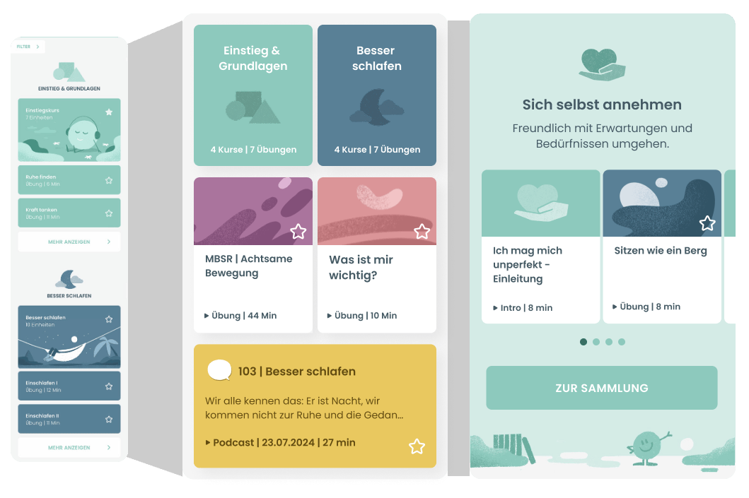
I analyzed and documented pain points and existing user test results. From there, I developed a wireframe concept, that initially restructured the Discover tab and Home tab.
I work in wireframes first to solve structural problems efficiently, so no one gets lost in visual details.
The iterations were developed in close collaboration with design, product, and development.

The new concept was rolled out gradually across multiple releases to gently bring existing users along.
The new concepts received highly positive feedback in
Particularly in UI design, I completely rethought the existing, rather monotonous presentation of content — without changing the illustrative brand identity.The new, partially makes content easier to scan and was allow users to immediately recognize previously listened content and favorites.
After the launch of the Discover tab, there were further projects I redesigned.
All new features passed the frequent user tests positively, and through the gradual rollout of updates, the app remained familiar and intuitive for existing users.