RE-
THINKING
BALLOON


RETHINKING
BALLOON
STRUCTURE MINDFULLY

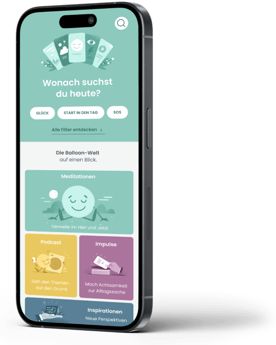
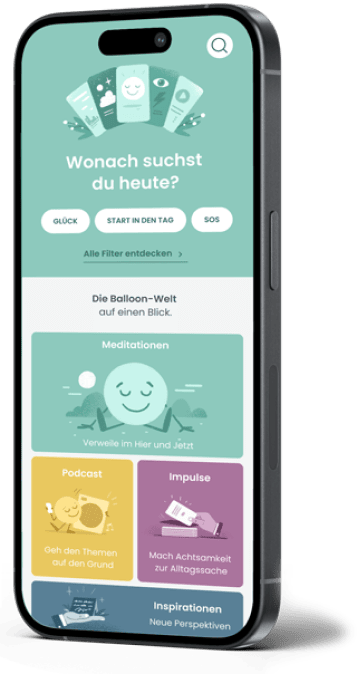
Balloon is one of the leading meditation apps in Germany. A team of ambitious neuroscientists and dedicated content experts has continuously enriched the app with new content. The product team asked me to provide UX support to restructure the “Discover” section and make content such as courses, meditations, podcasts, impulse cards and inspirations clear and accessible.
It quickly became clear that it was not enough to revise just one area, and so the redesign ultimately extended to the entire app.
Other key questions were: How can we visually differentiate the various exercises and at the same time provide helpful hints about their content? How can we present new content to the user in a simple and appealing way? We successfully tackled these and many other challenges in this very positive project.
In collaboration with the MissionMe team.
UX DESIGN
Take a deep breath AND HERE IT GOES LONG
Which meditation suits my mood best today? Which podcast topic speaks to me right now? And where can I find more content from my favorite speaker?
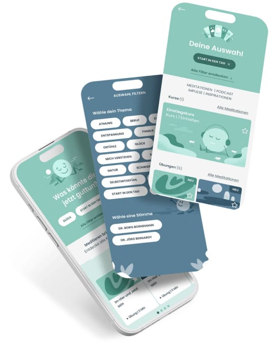
Balloon opens the door for its customers to a wealth of offers that help them to go through life in a more mindful and relaxed way. The Discover section is the perfect place to find inspiration. We have developed a clear and concise structure for the various offers so that users can find exactly what they need.
Whether filter options for those who want to let themselves drift and be spontaneously inspired, or a full-text search for targeted discoveries – everyone will find what they are looking for here.
We have put the features through their paces in numerous user tests to guarantee the best user experience.
UI DESIGN
Function meets charm
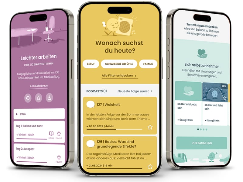
The visual language of the app was to be made more modern without losing its illustrative character. It was also necessary to clearly differentiate the various media formats visually and provide the user with enough information to find their way around the multitude of offers. To achieve this, I worked with the design team to develop a new functional design language that extends across the entire app without changing the illustrative brand image .

The design was also tested by users and improved where necessary. The updates were released step by step so that even long-time app users were not confused by a completely new app.
